Snapdeal
Web Design
Product Design
Branding
TL;DR
Snapdeal, one of India’s largest e-commerce platforms, faced high bounce rates, low retention, and user frustration due to a cluttered homepage, irrelevant product recommendations, and complex navigation. Through user research, competitor analysis, and data-driven design, the team streamlined the homepage, improved product diversity and personalization, balanced aesthetics with usability, and simplified navigation. These changes led to a more engaging, accessible, and conversion-friendly user experience.
E-Commerce
Category
2024
Year
UX Case Study
Role

Snapdeal is one of the largest e-commerce websites in India, with over 100 million registered users and more than 35 million products across 800+ categories. However, despite its popularity, the website’s user experience has been a topic of concern for many users. In this case study, we will analyze the UX problems on Snapdeal’s homepage and provide solutions to improve the user experience. We will also conduct research to understand the current state of Snapdeal’s user experience and provide insights into how Snapdeal can improve its website design.
Core Problem
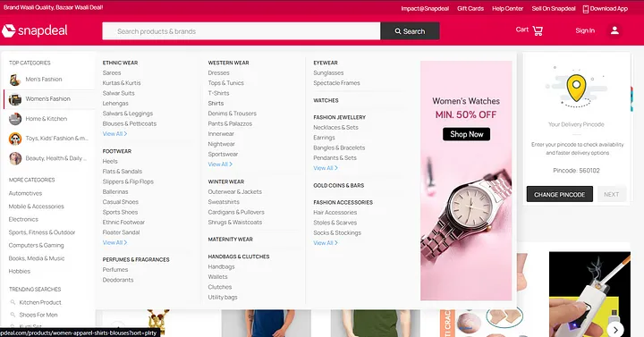
Snapdeal’s homepage suffered from a limited and repetitive product selection, confusing navigation, and irrelevant recommendations. Users struggled to find products, felt overwhelmed by clutter, and often left the site for competitors. This resulted in high bounce rates, low retention, and conversion rates well below industry leaders (2.86% vs. top performers at 11%).


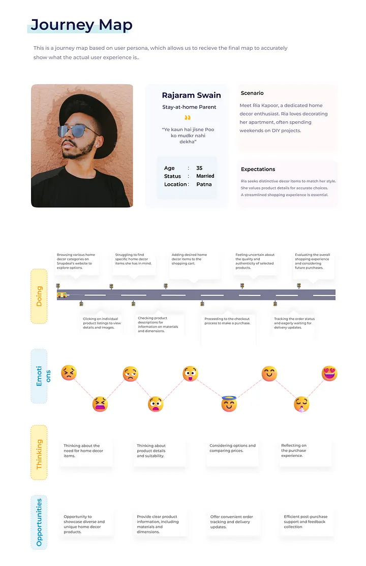
Our Process
User Research: Interviews, support ticket analysis, and data analytics revealed pain points in product discovery, navigation, and personalization.
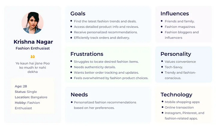
Persona Development: User personas were created to understand diverse goals and frustrations.
Competitor Benchmarking: Compared Snapdeal’s UX against Amazon, Flipkart, Meesho, and Alibaba.
Information Architecture Review: Reorganized categories and improved signposting for intuitive navigation.
UI Design: Enhanced NavBar accessibility with bolder fonts and hover effects; introduced a visually distinct category section.
Prototyping & Testing: Iterative design cycles with user feedback to refine layouts, navigation, and recommendations.

Our findings
High bounce rate and low retention were linked to insufficient product variety and homepage repetition.
Navigation complexity and poor visual hierarchy made it difficult for users to explore categories or find desired items.
Irrelevant product recommendations decreased user satisfaction and conversion potential.
Aesthetics vs. usability: Overly cluttered layouts and weak visual cues undermined trust and engagement.
Competitor analysis showed that streamlined navigation, personalization, and trust signals are industry best practices.
Solution & Design Approach
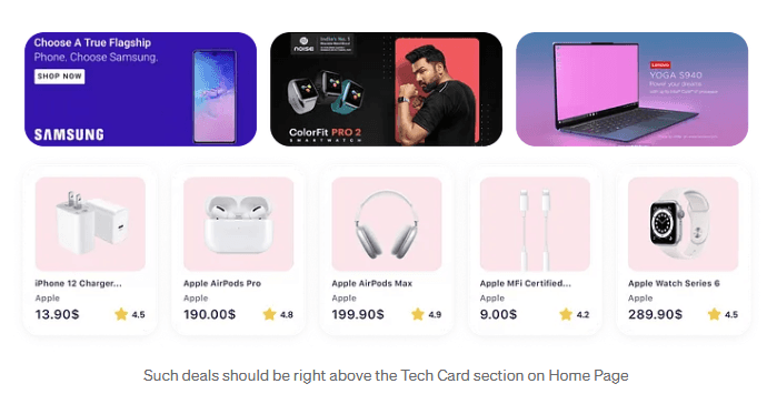
Homepage Revamp: Expanded and diversified homepage product offerings; implemented personalized, algorithm-driven recommendations.
Balanced Aesthetics & Usability: Optimized color schemes, font weights, and layout for clarity and appeal; minimized distractions.
Navigation Simplification: Clearer category hierarchy, improved graphics, and visual cues; enhanced search functionality.
Product Section Enhancement: Broader product showcase and personalized carousels to boost engagement and discovery.

Results & Impact
Bounce rates decreased as users found more relevant products and easier navigation.
Retention and engagement improved through personalized recommendations and a cleaner, more intuitive interface.
Conversion rates increased, moving closer to industry benchmarks (top e-commerce sites see up to 11%).
User satisfaction rose thanks to improved accessibility, faster product discovery, and a more engaging shopping journey.
Business Impact
Higher conversion and retention directly contributed to increased revenue potential.
Improved brand perception and trust, with a more competitive position against leading e-commerce platforms.
Reduced support queries as users navigated the site more easily and found products faster.

Moving forward, the focus will be on enhancing personalization algorithms, expanding homepage product diversity, and optimizing the mobile user experience to further boost engagement and accessibility. Additionally, integrating improved order tracking and customer support features will strengthen overall user satisfaction. Key lessons from this project include the importance of grounding design decisions in user research and data analytics, balancing aesthetics with usability to build trust, and embracing iterative design cycles that incorporate continuous user feedback-these approaches proved essential in achieving measurable improvements in both user experience and business performance.
Let’s connect — or collaborate.


If you’re hiring, building, or brainstorming something meaningful — I’d love to hear about it.